MY ROLE
Senior UX Designer: led design on both Macy’s and Bloomingdale’s mobile and web
GOAL
Implement new delivery & fulfillment features that will decrease friction for our customers
KPIS
Add to bag Rate, Bag to Order Rate, Conversion Rate, RPV, Order Penetration, NPS
The Problem
Customers have difficulty finding delivery & fulfillment information on our sites. The delivery and fulfillment offerings were buried toward the bottom of the homepage. Additionally, marketing banners only provides links to informational content on these services. We wanted to offer our users the ability to shop via these services early in the funnel.
The Solution
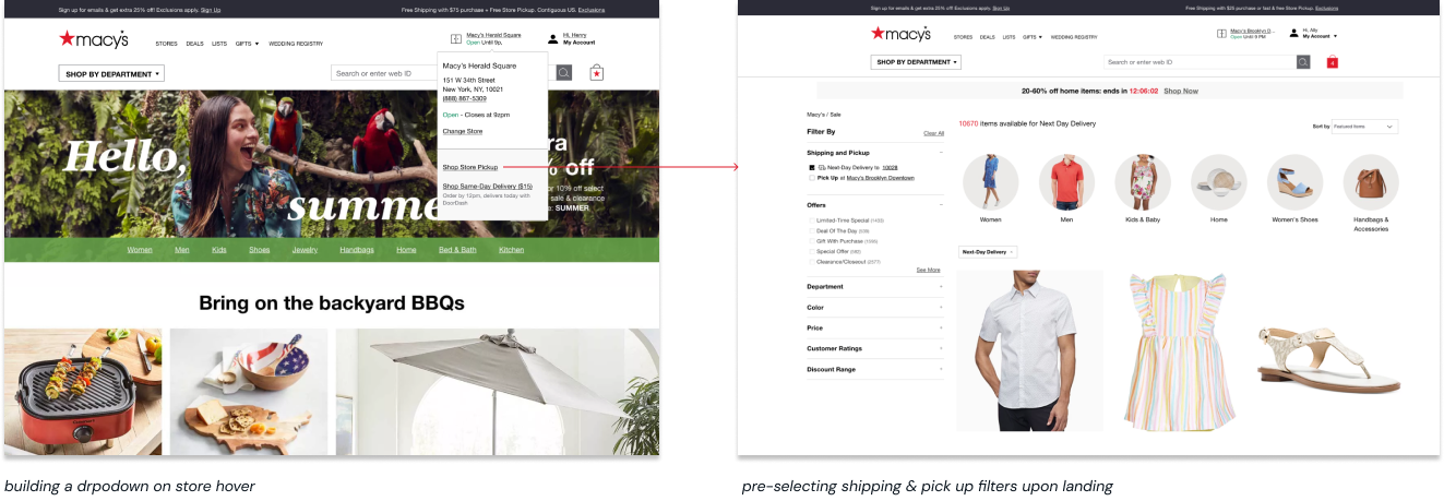
New Header Dropdown Menu
Relevant store information such as address, phone number
2 new entry points for shopping Store Pickup and Same Day Delivery
New dedicated Store Pickup and SDD product listing pages
These dedicated shopping funnels highlight items that are available for pickup at a customers preferred store location or for same-day delivery to their preferred zip code.
My Process
USER RESEARCH/INTERVIEWS
Solving for the Urgent Customer
Our research shows that customers struggle to find items that are available for Pick Up in Store and Same-Day Delivery. These customers already display extremely high intent based on their urgent needs so by getting them into dedicated shopping experiences earlier, they are more likely to convert.
BRAINSTORM
Weaving Together the Why, How and What
I led and facilitated design workshops such as Crazy 8 sessions and How Might We statement exercises. These workshops helped my partners and stakeholders think outside the box.
ITERATE
Contextual Placement
VALIDATING DESIGN
User Testing
As I finished a design based on the requirements, I conducted remote focus groups with 2-3 agents where I had them navigate the clickable prototype and explain what did and didn’t work with the design. I collected their feedback, updated the design and retested. This process was done for the "Validation Conflicts" screen.
THE RESULT
Agents agreed that this layout of the "Validation Conflicts" screen was easily scannable and gave them all the information they need upfront and within the context of the device ID swap flow. The use of icons and colors grab users' attention and guide them to see important information they have to relay to the customer.


