MY ROLE
UX Researcher & Designer
GOAL
Optimize the user experience of our sign-up flow to minimize errors and provide transparency. Our goal was to limit any issues that can occur when a new user is signing up for PointsBet. We wanted to make it clear what the user is inputting on each page of onboarding and explain why certain information is needed to sign up on the site.
ABOUT
PointsBet is a cutting edge Australian online bookmaker that has recently entered the newly formed U.S. market. PointsBet continues to develop its in-house, global sportsbook platform and product offerings.
THE USER JOURNEY
White Boarding Session
I met with key stakeholders and led a whiteboard session to identify the user flow and requirements.
Journey Mapping
I created a simple journey map of the user sign-up flow to visually illustrate our customers’ needs.
User Flow & Design Goals
I gathered the insights from my whiteboard and journey mapping sessions and established goals.
User Flow Goals
Evaluate whether categorization of steps and form fields are logical and intuitive
Analyze sign-up steps/order of the screens
Identify any confusion in relation to labels of form fields
Design Goals
Evaluate whether touchpoints are large enough for the user (on mobile)
Ensure accessibility (font colors and size)
Provide clear messaging
TOUCHPOINTS
Evaluate The Metrics
I worked with my colleague to identifying the primary metrics we would be want to track to see if the redesigned sign-up experience is successful.
CREATION
Updated Style Guide
My coworker and I recreated the current style guide to align with best modern design practices. Specifically, we investigated target size for buttons, forms on mobile devices and updated the brand’s color variations.
Iterations
Throughout the iteration process, I conducted user tests to validate the user flow and design goals.
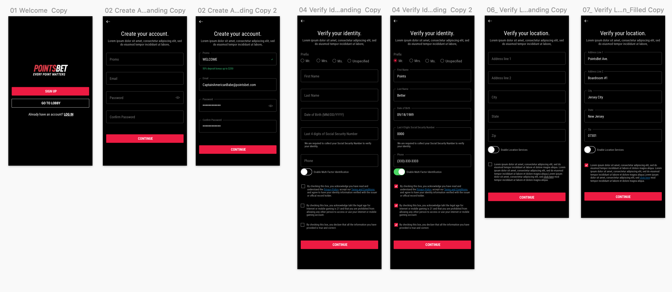
Design Iteration 1: Users felt that the “verify your identity” screen was lengthy and that some of the fields belong on the “create account” screen.
Design Iteration 2:
FINAL DESIGN & OUTCOME
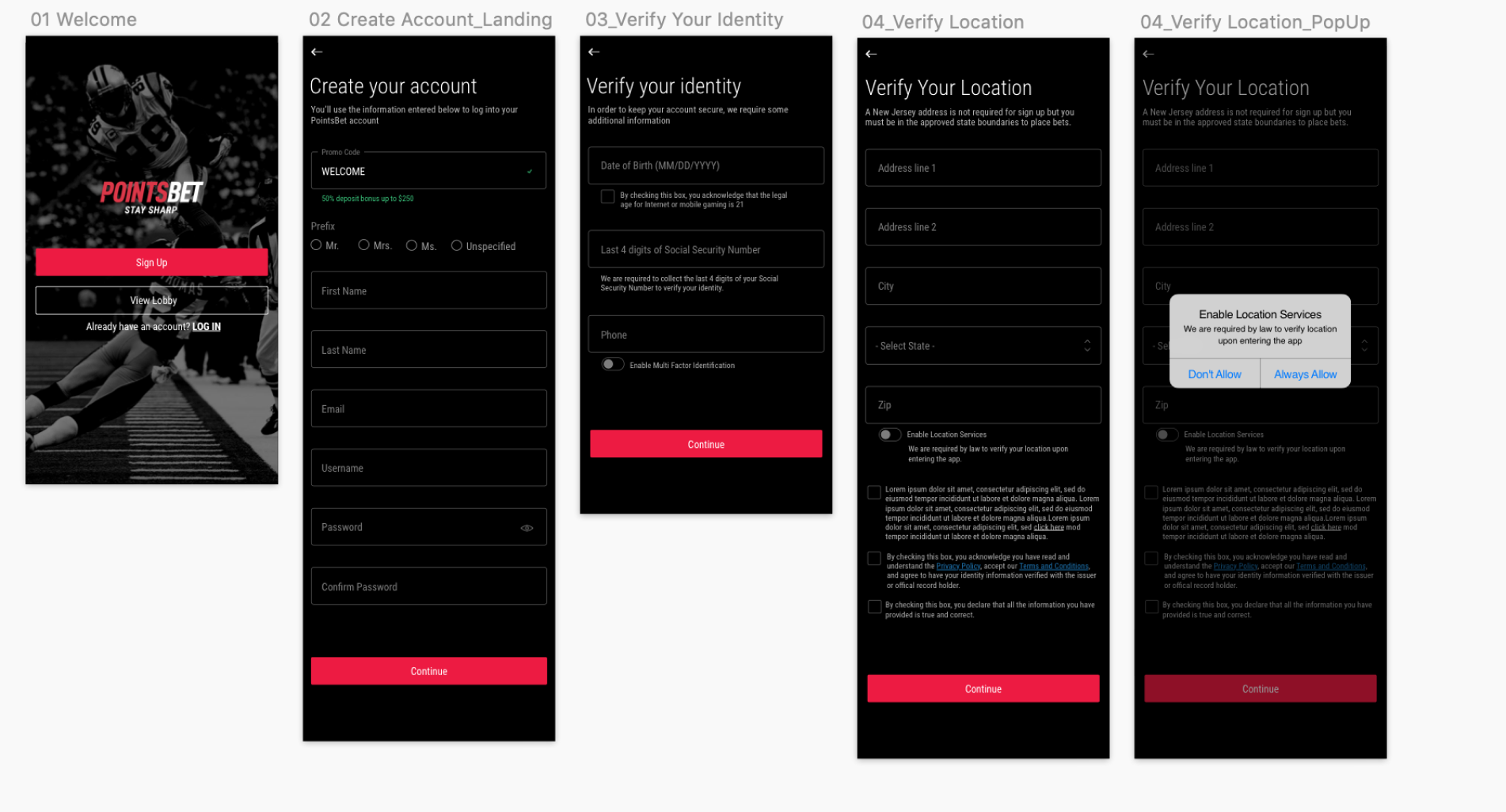
Design MVP
Due to tech constraints, the updated style guide could not be immediately implemented. As a result, I designed a minimal viable product using the existing style guide and based on user feedback. Due to these updates, sign-up conversion increased by 10%,


